Up to 90% of an initial impression comes from color. Color can increase brand awareness and recognition by 80%.
Many global brands capitalize on this fact, paying close attention and care when choosing brand colors for their logos and marketing materials. Effective and thoughtful use of color in branding doesn’t only look good, but can work to capture the attention – and business – of a target market in an efficient and powerful manner.
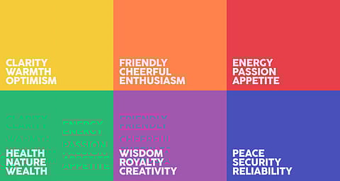
There are many colors, and the research shows that certain colors express certain emotions. Emotions!, of course, are major factors for consumers when they make purchasing decisions. Let’s see some of Colors and How to Choose.
Red
Strength
Passion
Excitement
Red is used extensively in marketing in the food industry, due to its ability to trigger appetite also known for its ability to convey strength, energy, and confidence, and as such some of the world’s most powerful brands make use of the color.
Green
Freshness
Growth
Safety
Associations with nature, grass, and growth, green is often used to indicate a commitment to the environment. green often communicates ideas of freshness, health, and all-natural qualities. However, darker shades of green can sometimes represent financial stability and wealth.
Blue
Loyalty
Trust
Intelligence
Companies choose the color blue in brands to evoke loyalty , and indicate high levels of precision in work also associated with intelligence and trust. Think about how many of today’s technology brands select some shade of blue for their branding and this is not a coincidence.
Yellow
Intellect
Joy
Energy
Yellow connotes positivity, high energy and optimism. Many forward-looking brands stimulate creativity, and to capture consumer attention. In addition to being fun and cheery, yellow is often used to evoke a “happy” brand image for consumers.
PURPLE
Royalty
Superiority
Luxury
Purple is a sophisticated yet mysterious color. It tends to be used with higher-end products due to its association with royalty and elegance. Purple's mysterious element is also linked with spirituality.
BLACK
Mystery
Power
Elegance
Black is most often used in luxury brands. The color is symbolic of power and sophistication, so it is well suited to brands that are more classy than others. Black can also mean security.
PINK
Nurturing
Creativity
Youthfulness
For companies that want to look different, be memorable and feel forever young, choosing pretty in pink is always the way to go. Representing a feeling of youth, fun and feminine connotations, pink has always been a popular choice in this industry.
Keep in mind that the effect of your branding colors depends on the style and design they are used in, as well as the color combinations you choose. Use of the color in branding often evokes the following emotions among viewers.